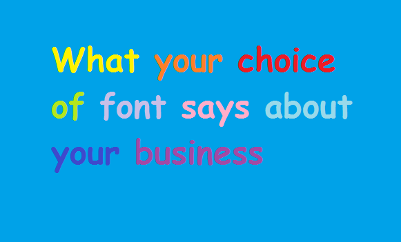
Content is often only as good as its presentation. No matter the work you put in to a document, formatting in the wrong font can completely undermine the tone.
Not such a big deal when you’re handing out documents in the office. But for important meetings, or when dealing with potential clients, it’s crucial to give the right impression of your business.
Consider the audience for your piece, and the sector you work in. Creative designers will be looking for a unique style. Law firms need clean and clear fonts to use in lengthy documents. Plus, printed materials will suit some fonts far more than digital mediums. There’s a lot to think about. However, there are some general rules of thumb that can guide your decisions.
![]()
“Analogous to showing up for a black-tie event in a clown costume” – Holly and David Combs, founders of bancomicsans.com
If this piece is talking about the most and least professional typefaces available, there is no avoiding the most controversial: Comic Sans.
Created by Vincent Connare with the purpose of replacing Times New Roman on Microsoft, the font may have done the job a little too well. Considered childish and immature, Comic Sans is widely regarded as suited only to primary school. The heavy weighted characters are particularly accessible to dyslexic children, who find the lettering easy to engage with. However, in a professional context: Avoid. Comic. Sans.
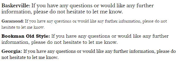
Serif fonts
A more traditional style of typeface, serif refers to characters with small projecting features. That is, the feet and tips at the end of the character strokes. Generally, serif fonts work best on printed materials, because the projecting features guiding the eye naturally along the line of text. However, with continuous screen and resolution development, this is likely to become less of an issue as time progresses.
The most common example is:
![]()
Dubbed as default, Times New Roman has always been the go-to typeface for writers wanting to appear professional. A safe choice, although the font has become a little overused.
Consider using one of the following for a slight alteration on the classic:
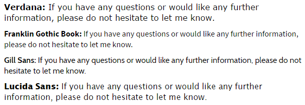
Sans Serif fonts
Dominating the online medium, sans serif is the name given to fonts without these small lines at the end of the character line. A crisp, more finalised close to each letter, sans serif fonts are professional and a little more unique.
The main sans serif font used is:
![]()
In the same way that Times New Roman as a font is satisfactory but safe, Arial is the sans serif equivalent.
A classic typeface, that would do the job adequately, but if you’re looking to set yourself apart from everyone else, it might be worth considering:
The fonts library presents writers with a seemingly infinite choice in typefaces for their content. Consider your audience and means of publications, and choose a font that you are happy to replicate, paying attentions to quality, legibility and versatility.