Which fonts use the least ink?
If you’re an environmentally responsible business, you’ll be aware of how to stay eco-friendly in printing, while simultaneously shrinking your outgoing costs. Things like using both sides of the paper, adjusting documents margins, and recycling wasted paper as scraps or rough drafts are all relatively simple things to implement. Reducing paper usage means reducing paper cost, and overall waste.
But you can do more!
Some things that are less obvious than simply using less.
In 2014, 14-year-old Suvir Mirchandani from Pittsburg, Pennslyvania found that he could save his school $21,000 a year – simply by changing the font they used on their hand-outs to Garamond. Extrapolating to the US Government, he estimated that he could save his country $400 million annually, an equivalent of £240 million every year.
If yours is a business that prints regularly, these are figures you can’t afford to ignore. Given that printing ink can cost almost twice as much per ounce as Chanel No. 5, how much could your business be saving?
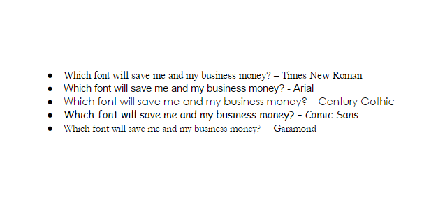
Compare the following:
The only flaw in Mirchandani’s experiment is that Garamond is a much smaller font. As such it can be far less legible to read. For a reputable business producing professional documents, this can be a problem.
However, the logic of using an aggregate of less ink in order to spend less money still applies.
Examples
With Comic Sans’ thick lines and large print size, it makes for a poor printing mileage and a costly font to use (not to mention its notorious childlike, unprofessional connotations). The classic Times New Roman seems an acceptable and inoffensive font to use in business, but the thick connections per letter actually make it inferior in its efficiency when you compare it to Century Gothic.
The consistently thin print lines mean that Century Gothic uses 30% less ink than Arial, and is the most ink efficient font on the list. The only complaint is opposite to that of Garamond: the font is pretty big. The letters are wider which means that documents occasionally end up using more pages. What you gain in ink efficiency you may lose in paper efficiency.
An easy solution: change the size of the text. As Century Gothic naturally sits a little wider, you can afford to shrink your text and maintain legibility.
For example, consider the following:
By placing the text so close to each other, an easy comparison is made. Easily readable, the modified Century Gothic text uses less ink as well as less paper.
So, if you’re looking to manage printing expenditure, consider your default font. It’s surprising what a difference it makes.
Many fonts can be found with Google here.

